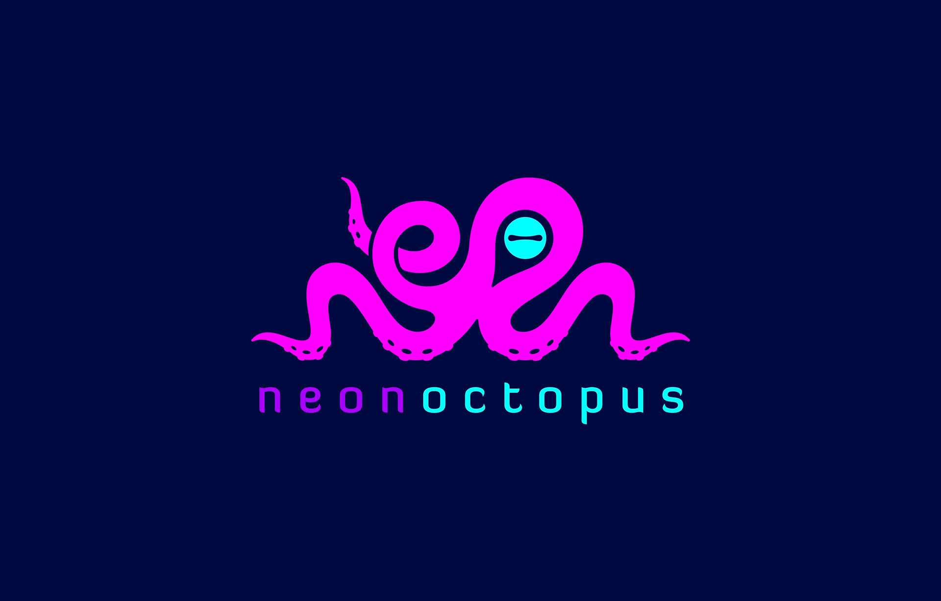

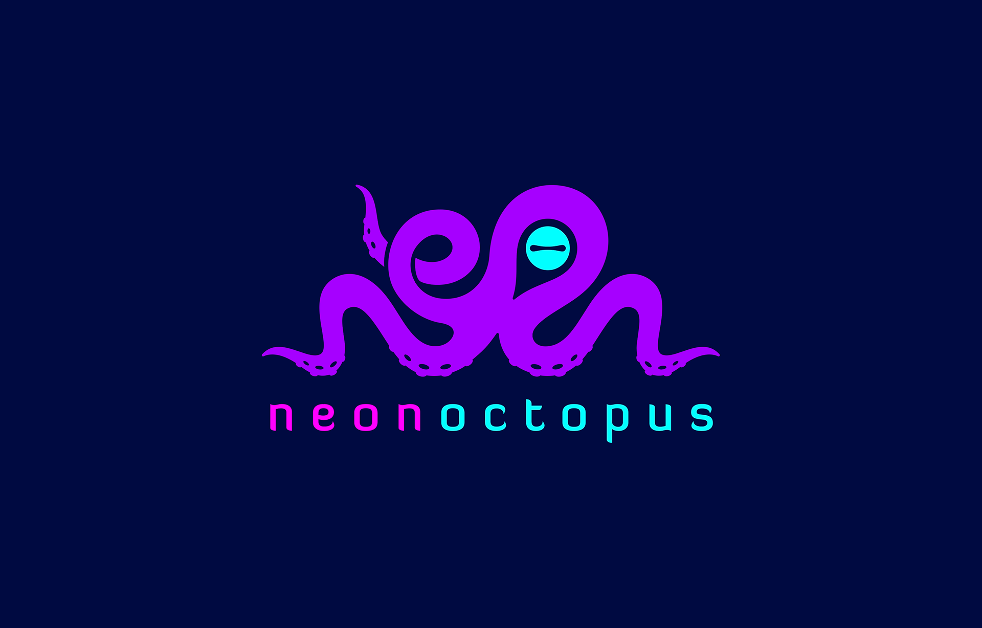
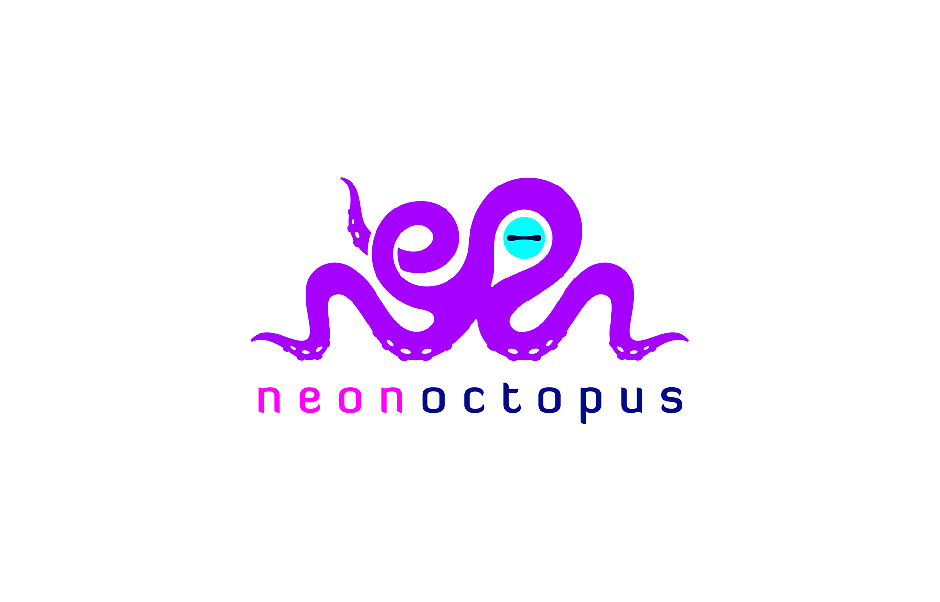
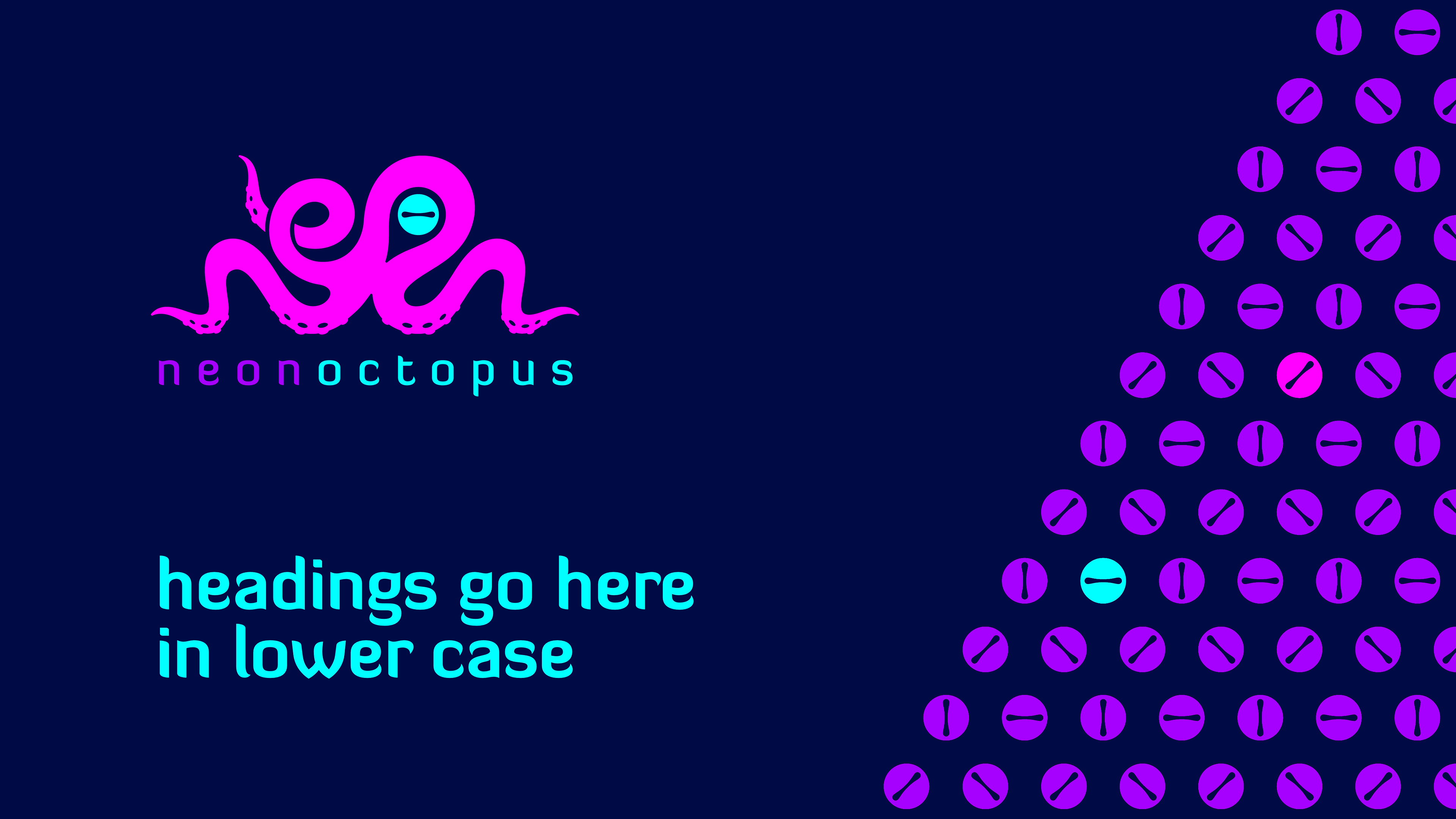
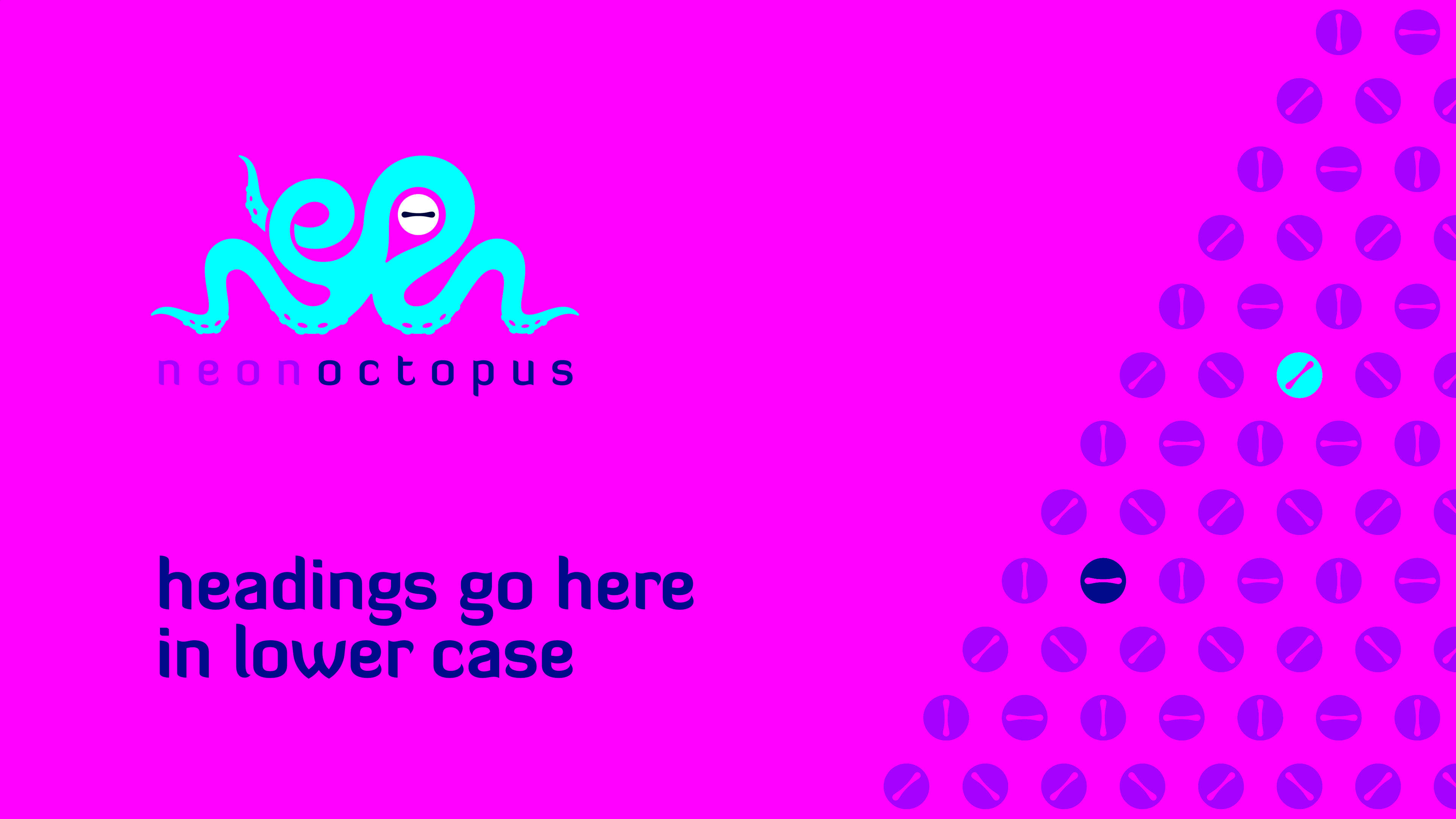
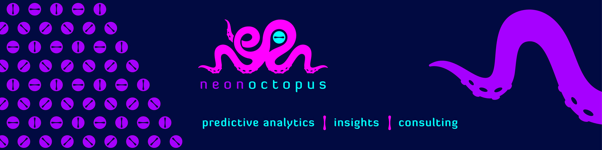
Primary logo use - on navy and on white
PowerPoint Presentation slides
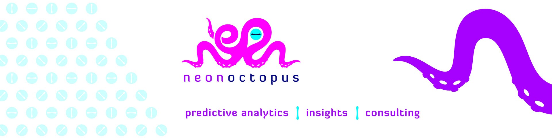
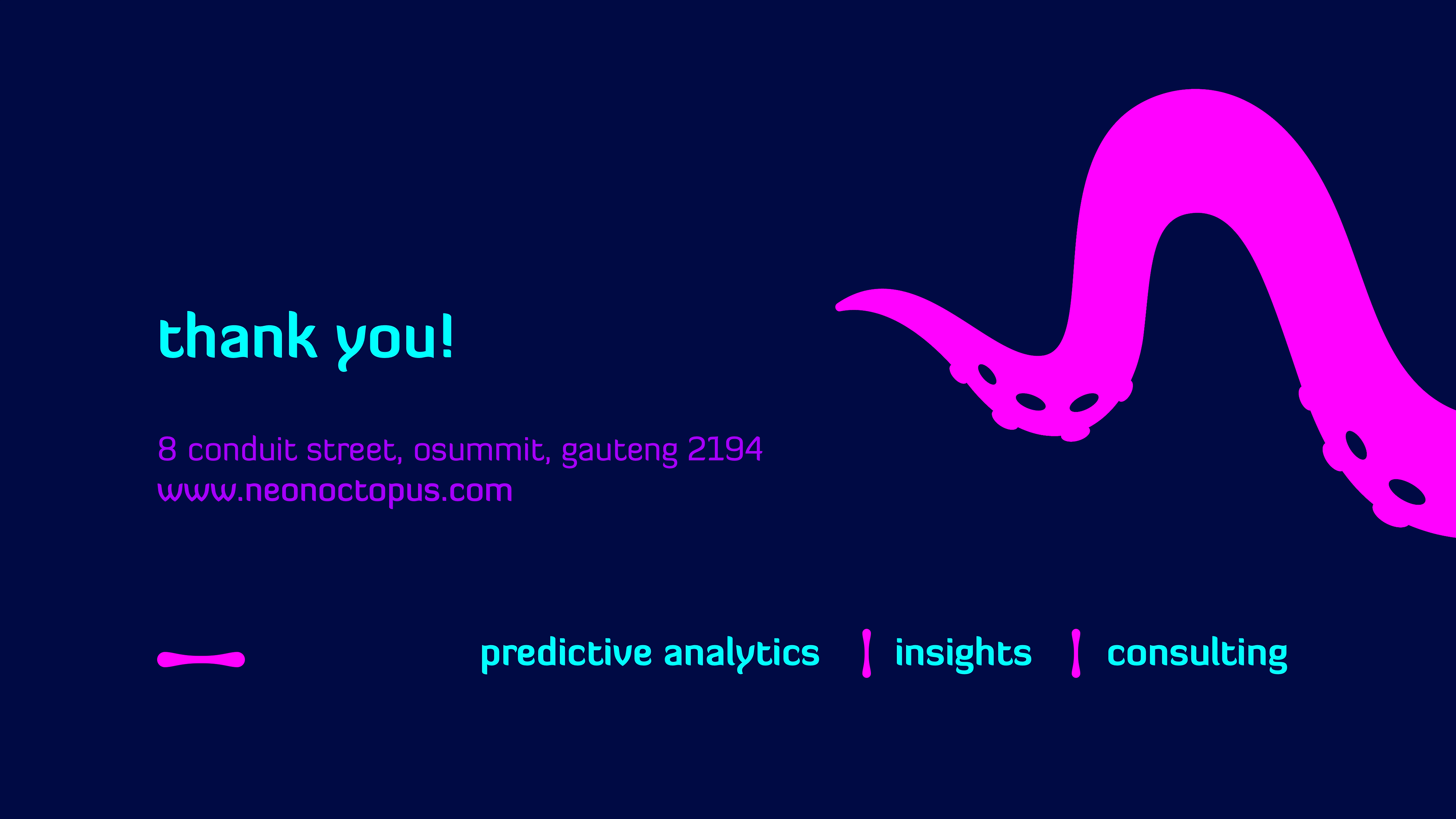
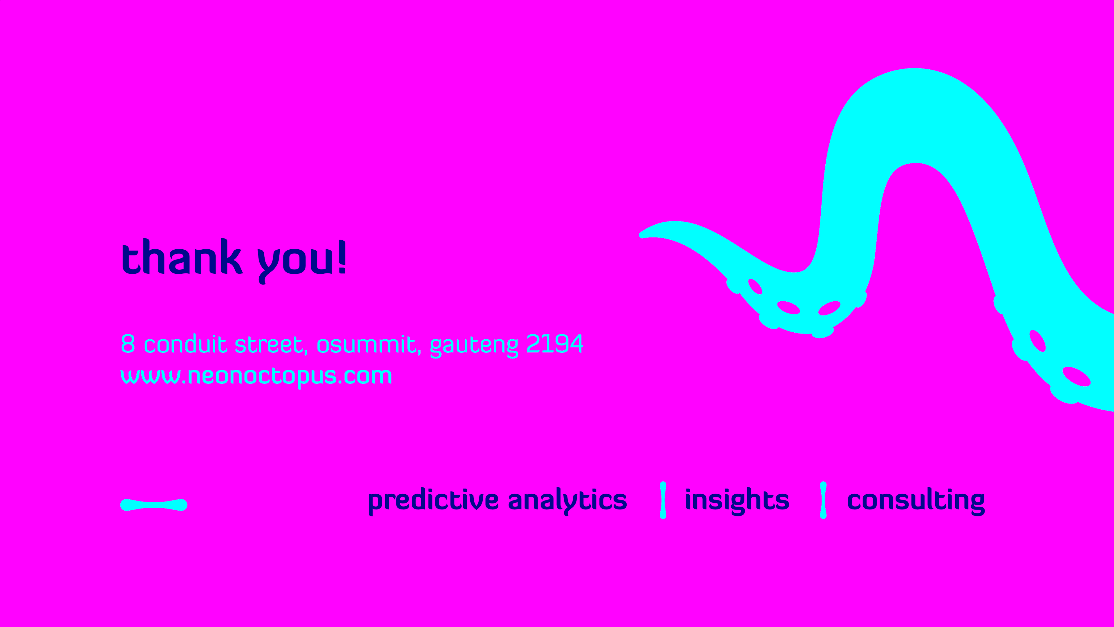
LinkedIn banners
Neon Octopus are a brand new Market Research, Analytics, and Insight agency, founded by people with decades of international analytic and market research experience. They bring new data processing and insight development tools to market as we’re enabled by emerging technologies in particular AI. We were briefed that Neon Octopus has to be a fun, playful, unafraid, intelligent, a lot of heart, brave, tenacious, experimental, vibrant and disruptive brand. The stakeholders are definitely data nerds, but dress well and ARE fun at parties. The NEON stands for us being vibrant lively attention grabbing but also bringing the insights to light. The OCTOPUS is flexible, intelligent (1 big doughnut brain and 8 smaller brains with each tentacle), an escape artist (problem solver), adaptable, a lot of heart (3 hearts), flexible and otherworldly. Bringing the Neon and the Octopus together is like blending the translucent and organic. The icon is actually an illustrated octopus word-mark making up the word 'neon'. Besides the tentacles, the ‘octopus eye’ is also used as a secondary device for patterns and text dividers.