
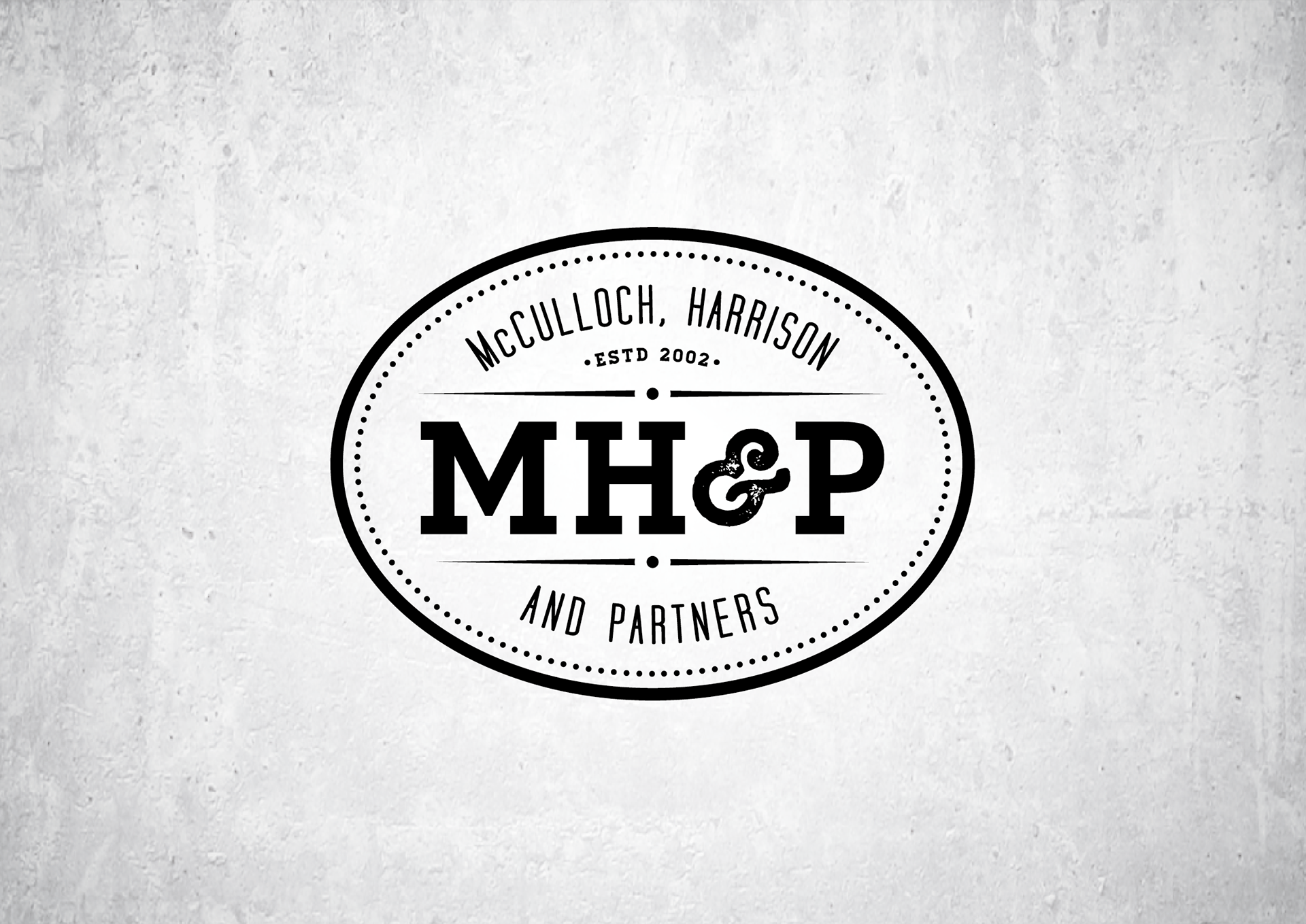

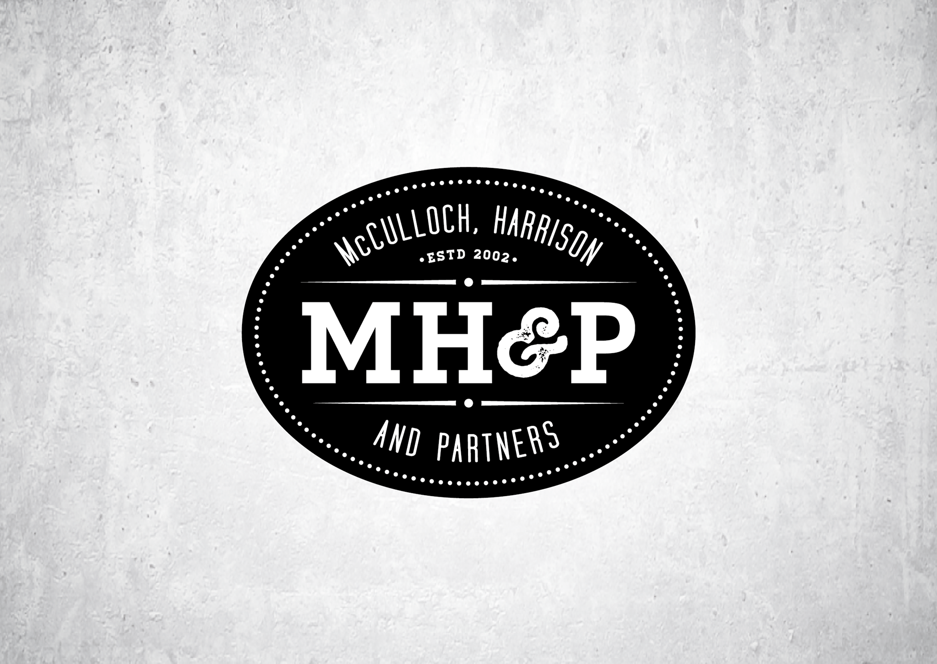
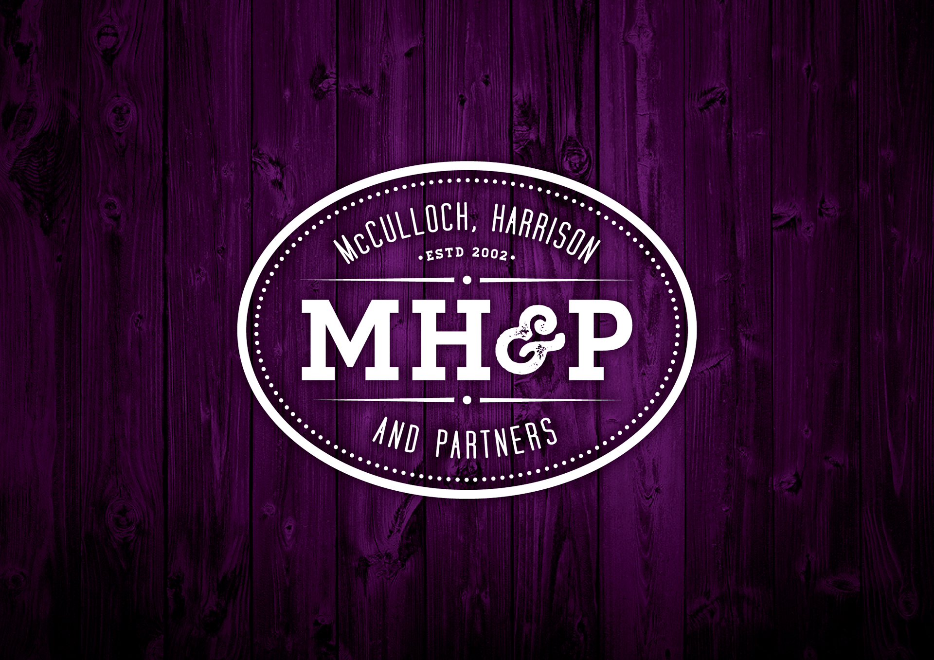
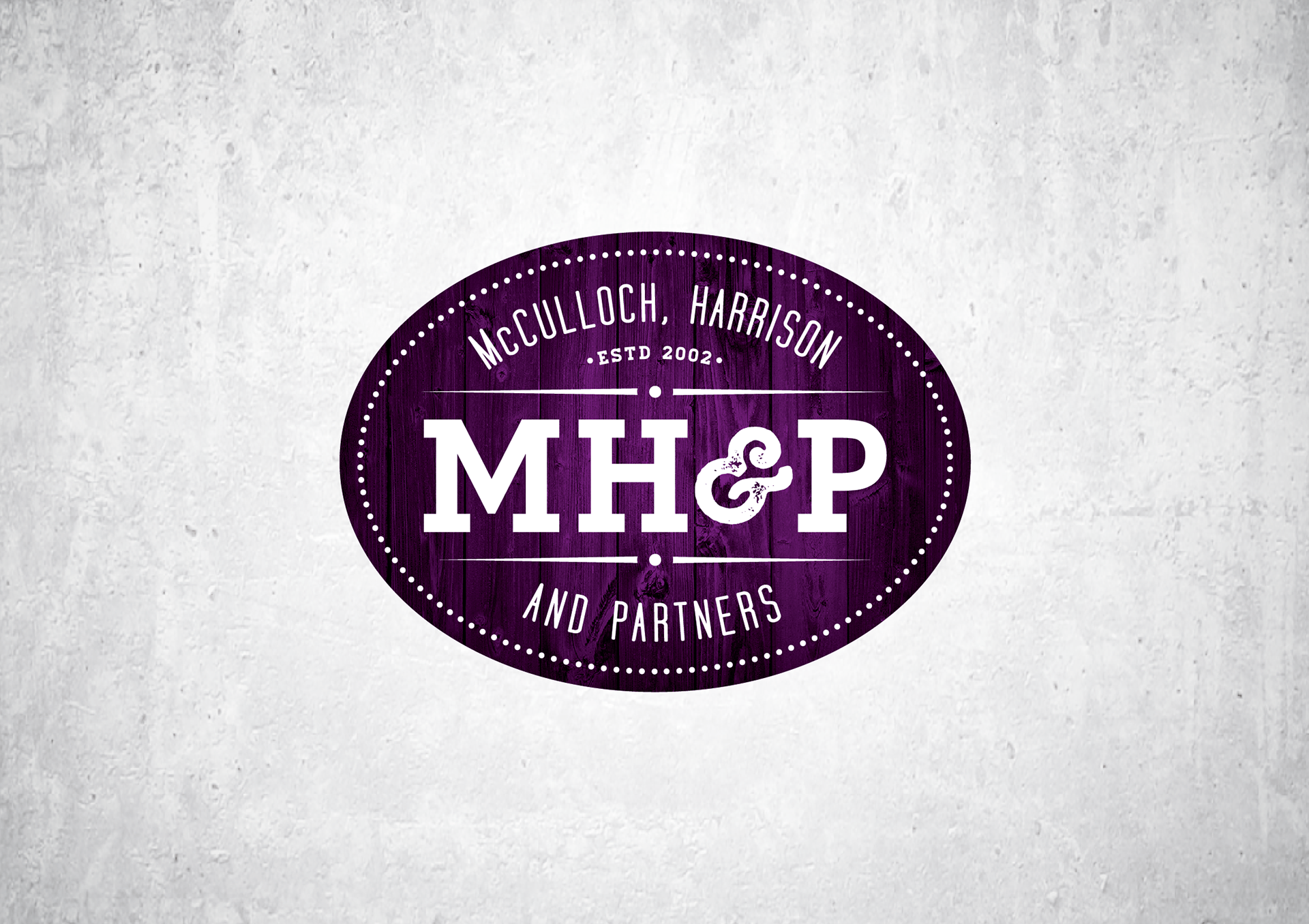
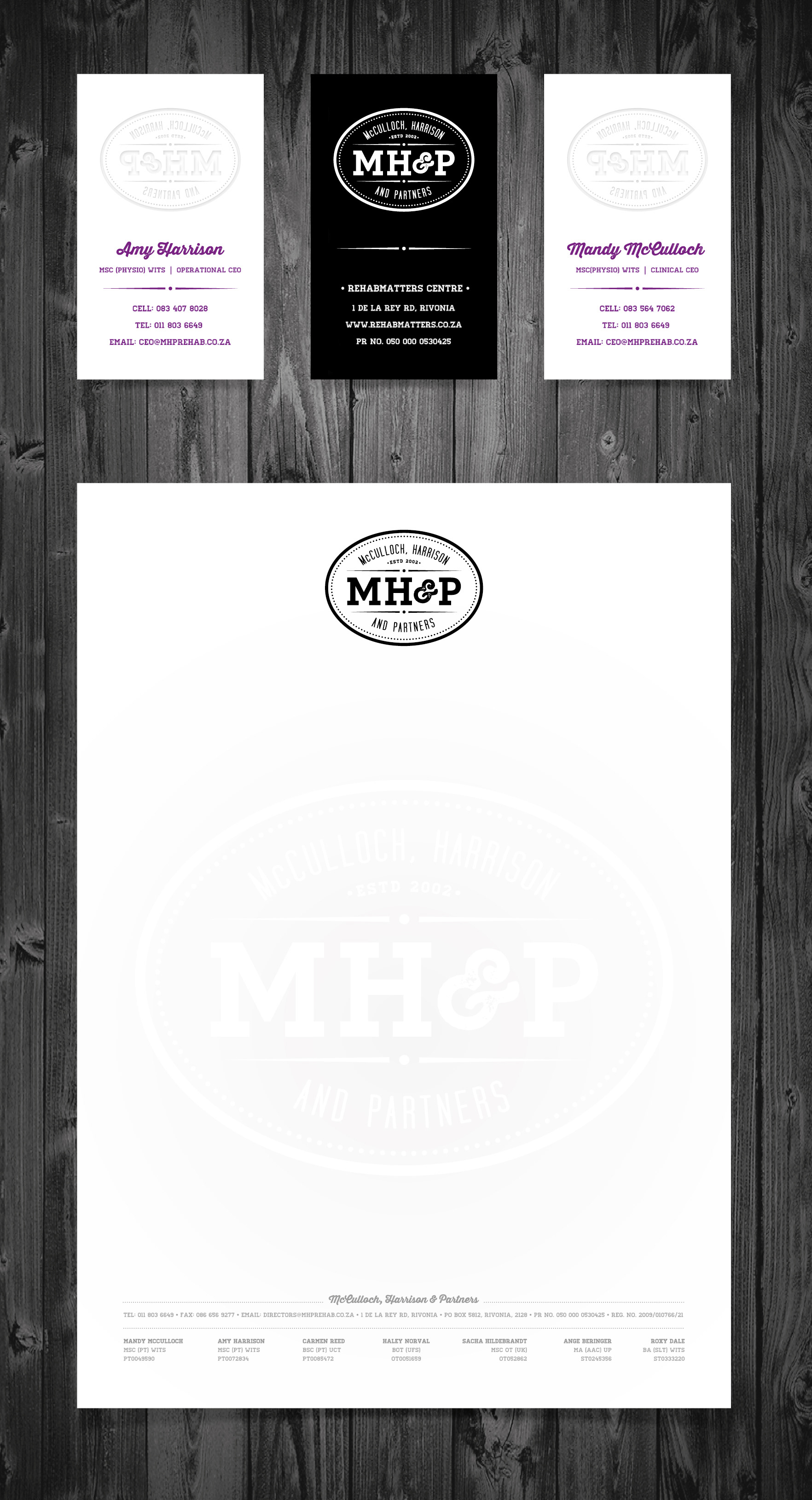

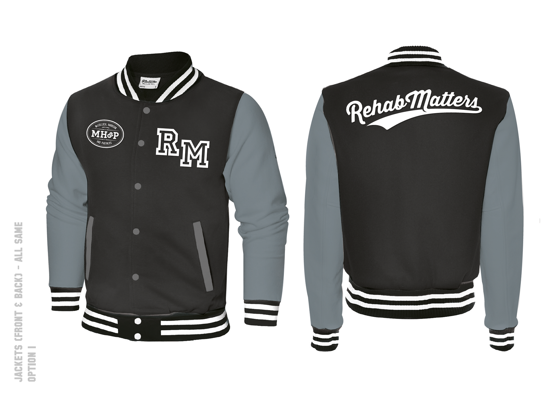

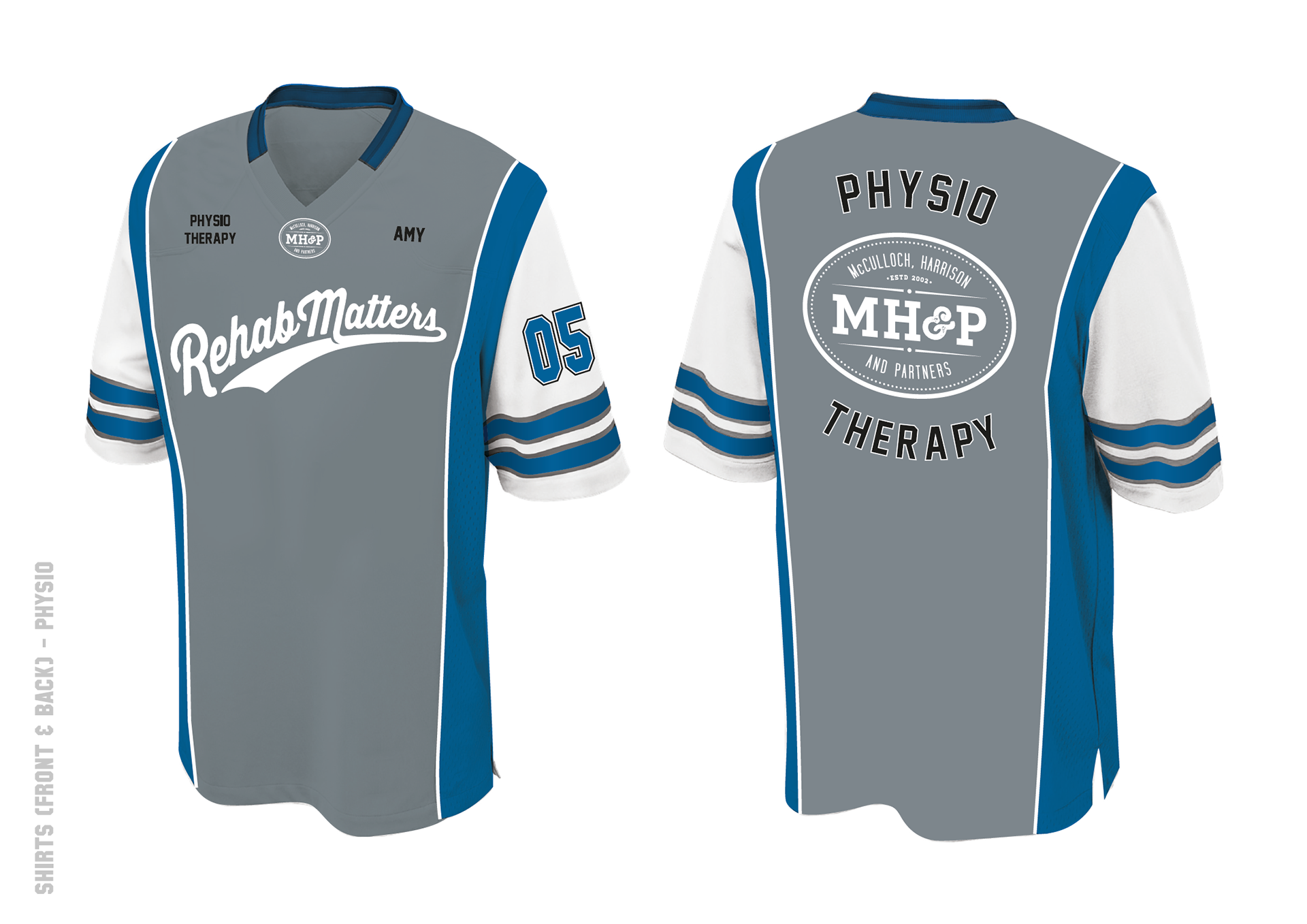


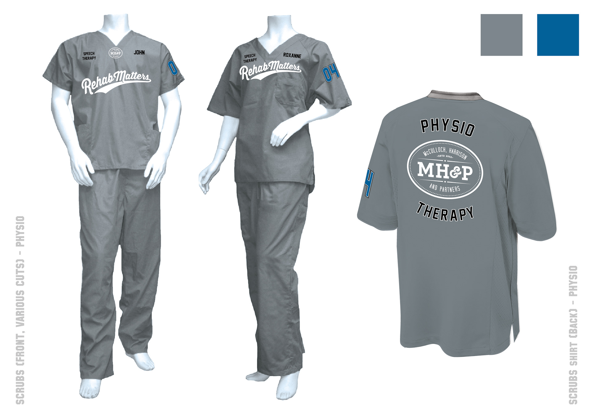


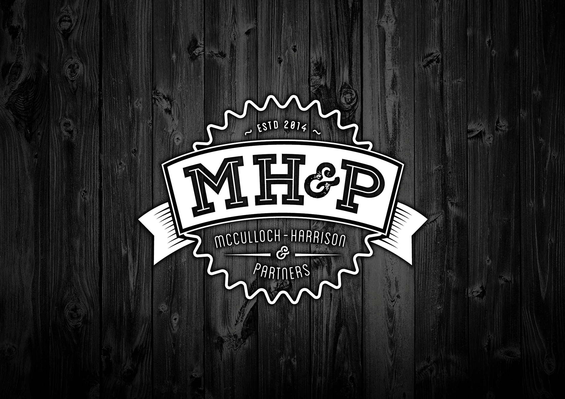
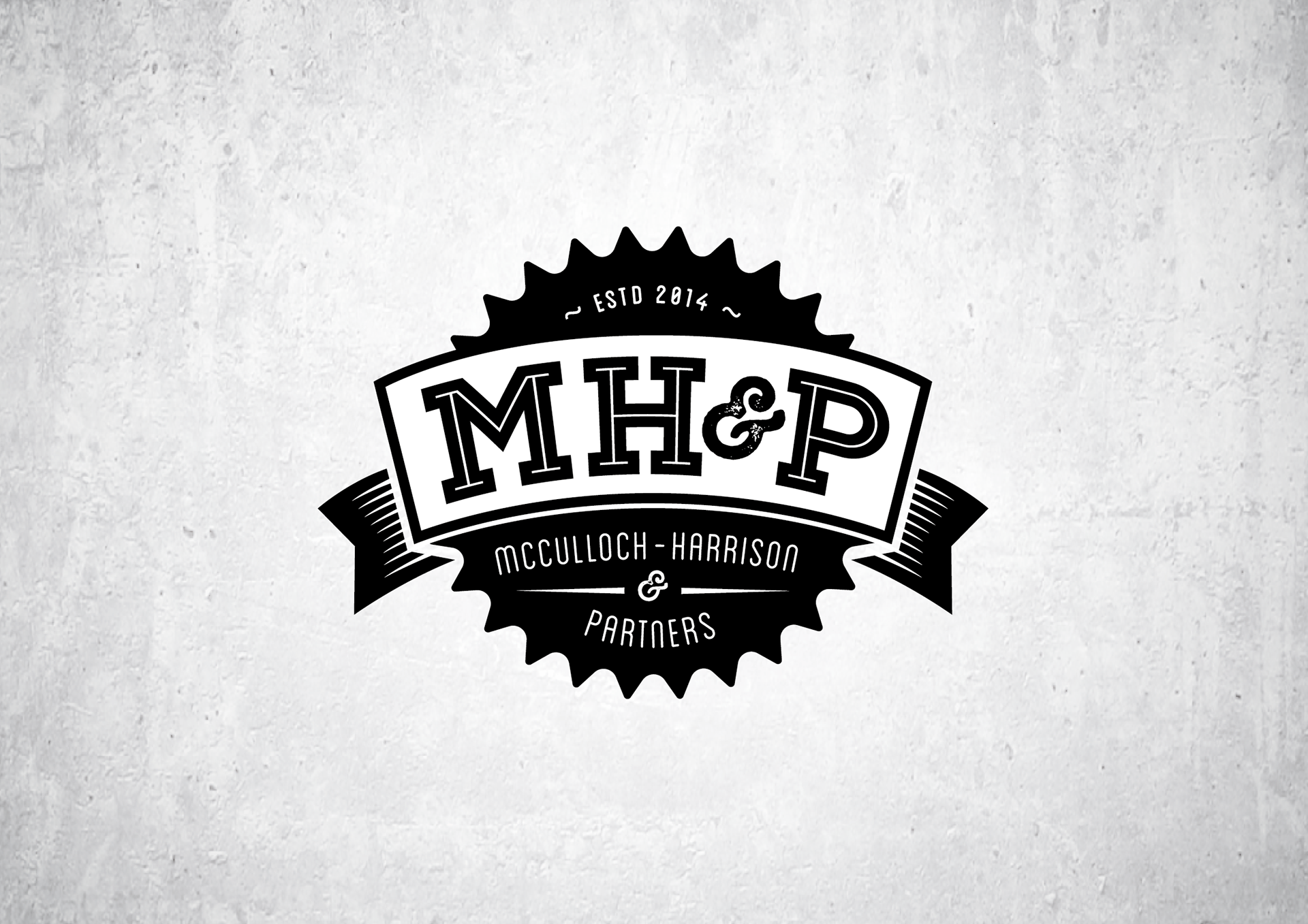
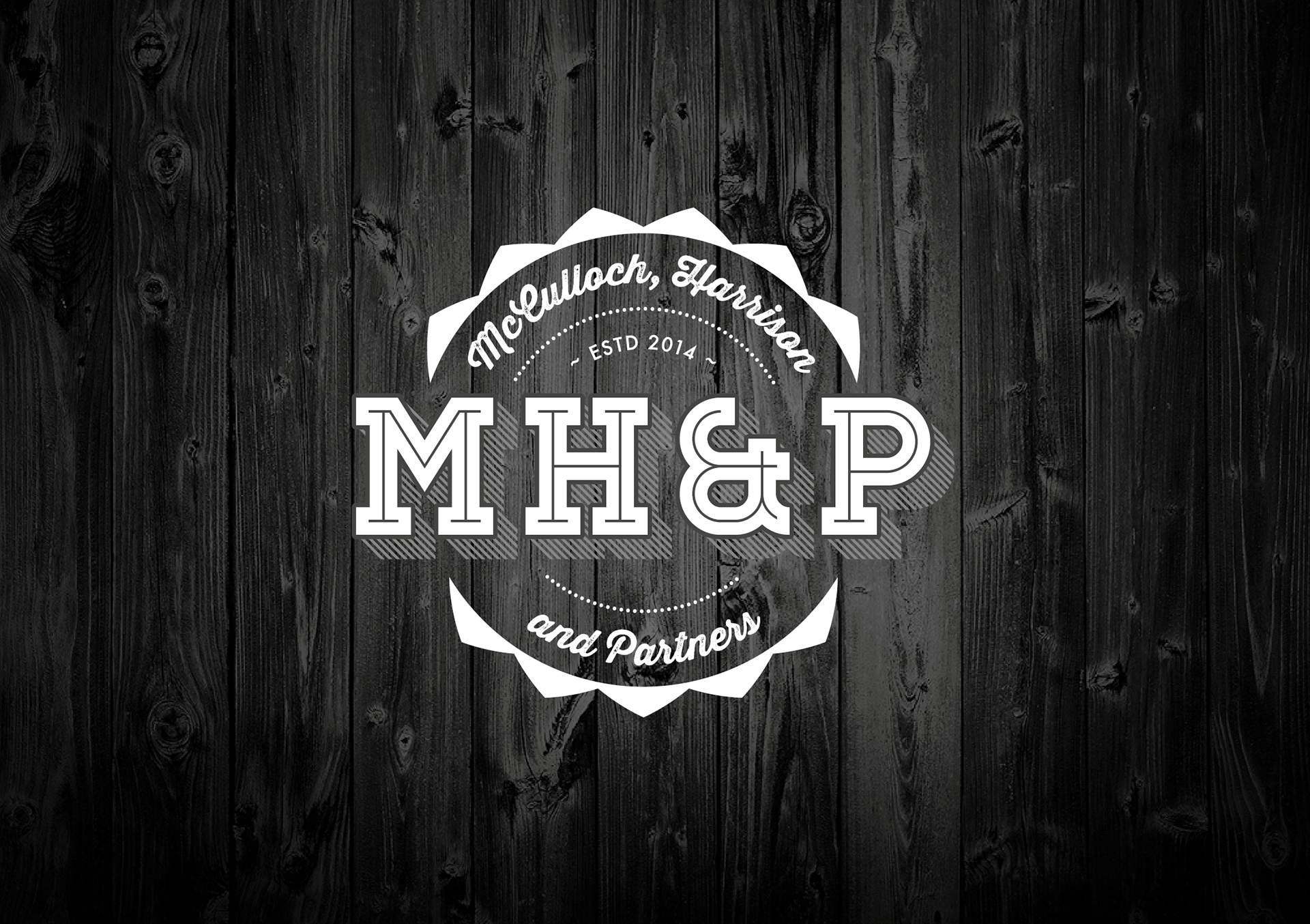
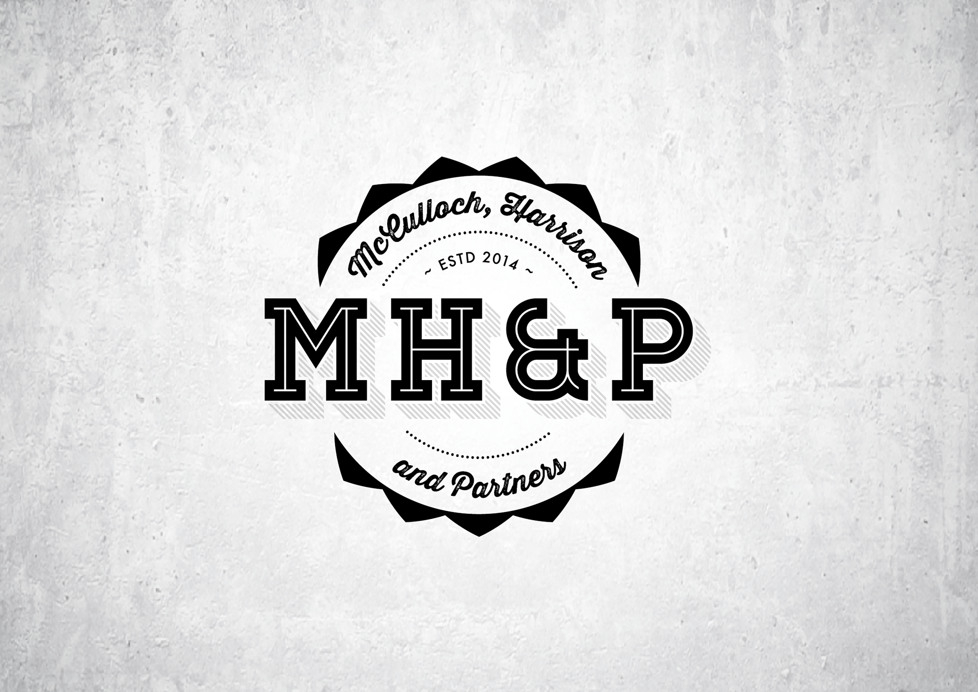

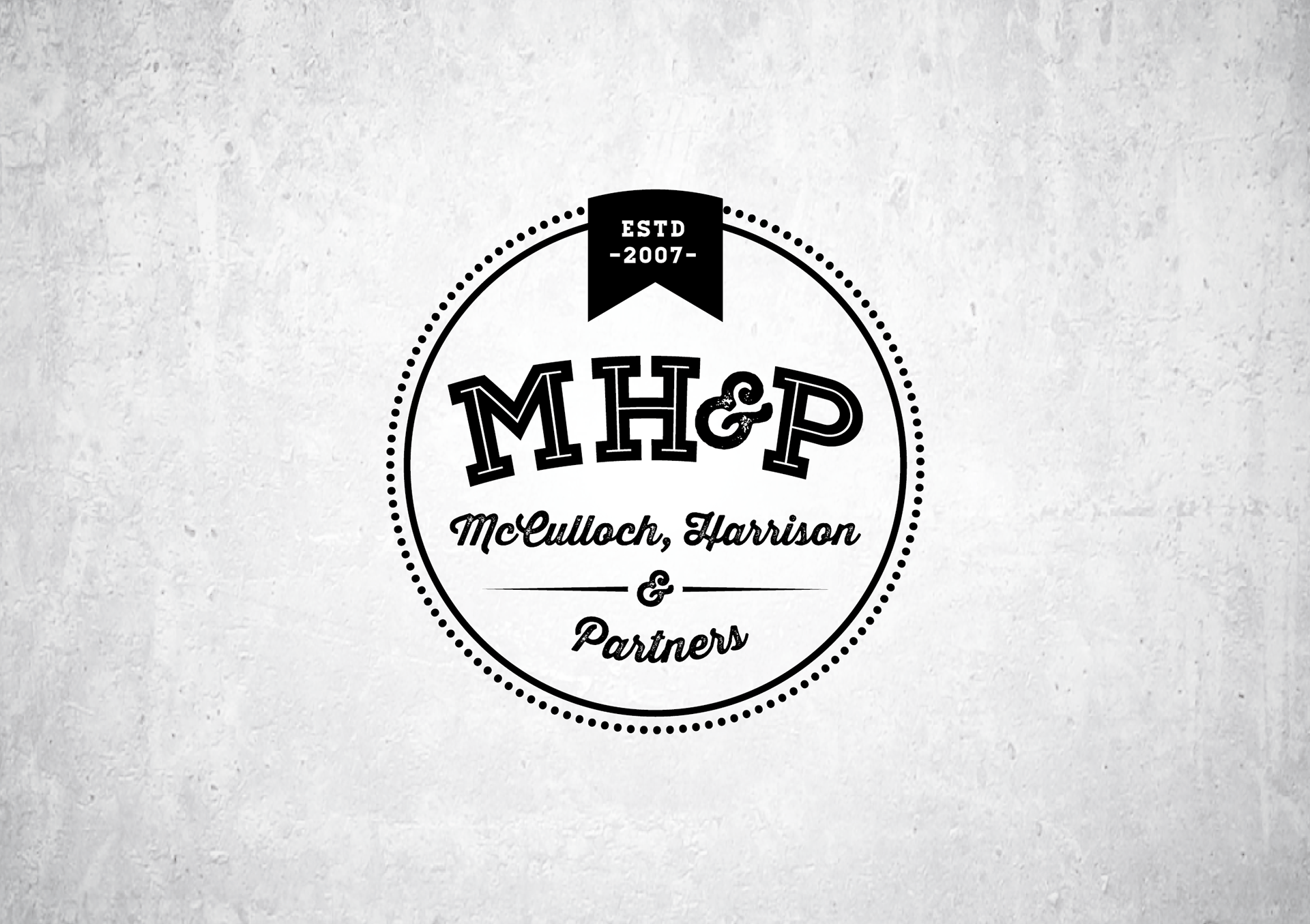
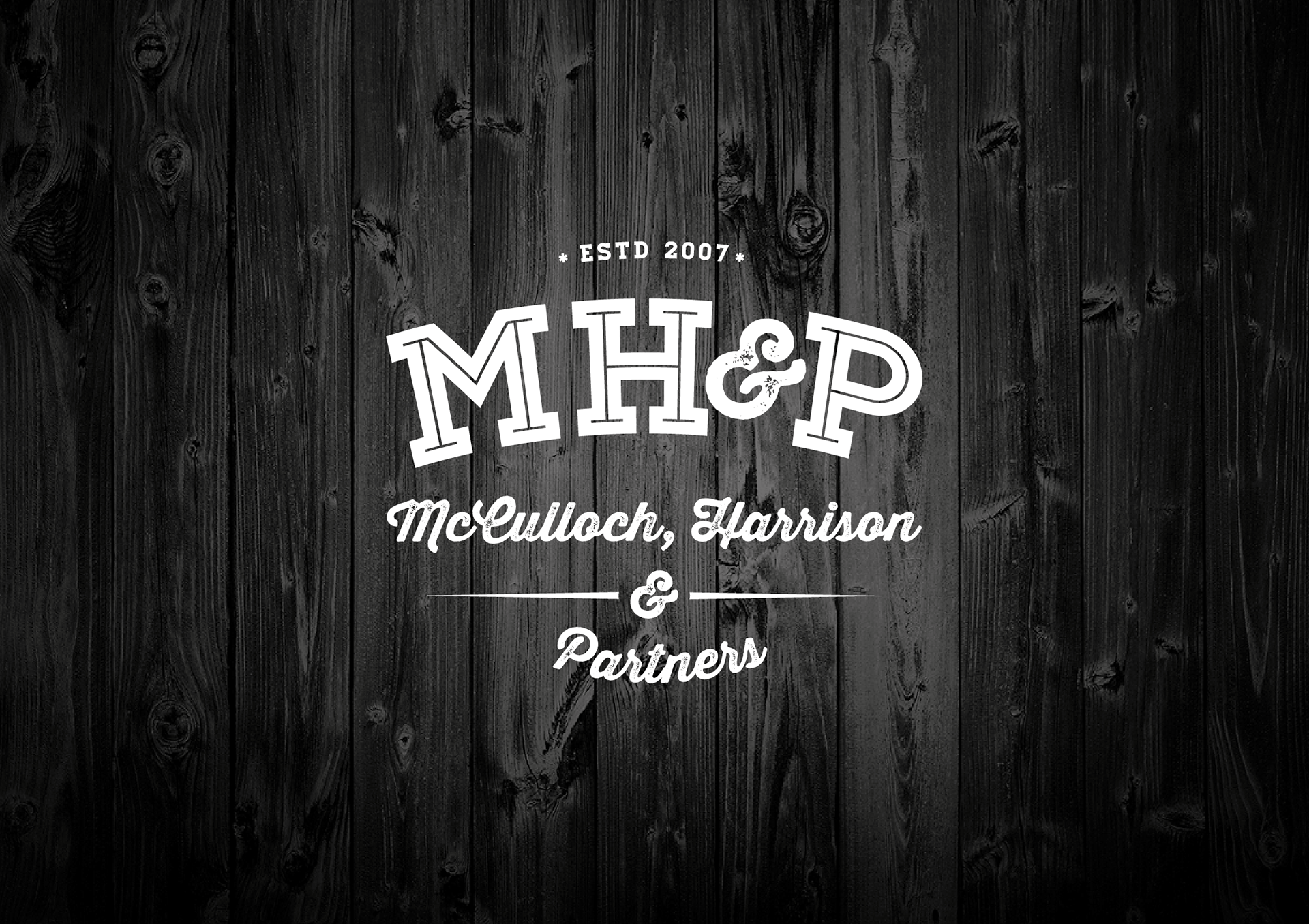

This is a recent logo for a new company of therapists who have banded together to form a new entity. They each had their own sentimental workways and nostalgia, which we had to incorporate somehow. Thus the idea of a “retro stamp” with an “established date”, which seemed appropriate. Shown here are the various ways in which the logo can be used - from outlined to solid and on different backgrounds. With regards to the corporate identity elements, the idea of an embossed single-colour printed business card (with all the generic information pre-printed on the front) but all individual details applied on the reverse (with an actual ink stamp) proved a unique but effective execution. The letterheads and email signatures were clean and simple layouts that combined function with design as we had to incorporate seven different directors names and qualifications. We also had to create uniforms - from every day work tops, scrubs for hospital visits to jackets. The vintage and retro theme was carried through to these applications by using similar designs found in baseball and football kit. Also included below, are some of the semi-final "W.I.P." options of the logo.