![](https://cdn.myportfolio.com/b83c7c4d8947315a1cb8ed4ab070afae/1344be5c40a827196c2ae6ab_rw_1920.jpg?h=7ea2fa75e36a7e3b46bb95496be86716)
![](https://cdn.myportfolio.com/b83c7c4d8947315a1cb8ed4ab070afae/fe2ec82645c80fa53e1ecf43_rw_1920.jpg?h=016321e38b215a87f6ab775738ecaa86)
![](https://cdn.myportfolio.com/b83c7c4d8947315a1cb8ed4ab070afae/7f169907cdea1c29873b25c6_rw_1920.jpg?h=e47105352d79e409513a6901d2c06b22)
![](https://cdn.myportfolio.com/b83c7c4d8947315a1cb8ed4ab070afae/227f60bee346733a919654ac_rw_1920.jpg?h=8cb17c65cf809daeccf1a0a798377b1b)
![](https://cdn.myportfolio.com/b83c7c4d8947315a1cb8ed4ab070afae/2fd34a616984f54bf6659496_rw_1920.jpg?h=b20df07f855ea18ca0f93817c802ba56)
![](https://cdn.myportfolio.com/b83c7c4d8947315a1cb8ed4ab070afae/eab0f77041046ba32e0578de_rw_1920.jpg?h=6df1eb82b4efbf454ff9568ba4137feb)
![](https://cdn.myportfolio.com/b83c7c4d8947315a1cb8ed4ab070afae/4042ab885b703a43b614f0cd_rw_1920.jpg?h=80b880543d12349e7bafae449c4615bc)
![](https://cdn.myportfolio.com/b83c7c4d8947315a1cb8ed4ab070afae/79f6a1400a163a12820241e9_rw_1920.jpg?h=4c683cfaca52b0f480e33bdef3b0eefd)
![](https://cdn.myportfolio.com/b83c7c4d8947315a1cb8ed4ab070afae/2acd8e5d6dcc5bc87bd62a75_rw_1920.jpg?h=1b5faeeb162687f0b316f9f06ddf72c5)
![](https://cdn.myportfolio.com/b83c7c4d8947315a1cb8ed4ab070afae/af03f2bece7f4fd23b8adb64_rw_1920.jpg?h=a8d8cf649bd567b4dcfb086b4af802a2)
![](https://cdn.myportfolio.com/b83c7c4d8947315a1cb8ed4ab070afae/d11a7e1b4a270507b610813f_rw_1920.jpg?h=50797d98c3d14379710362d5b129b1b9)
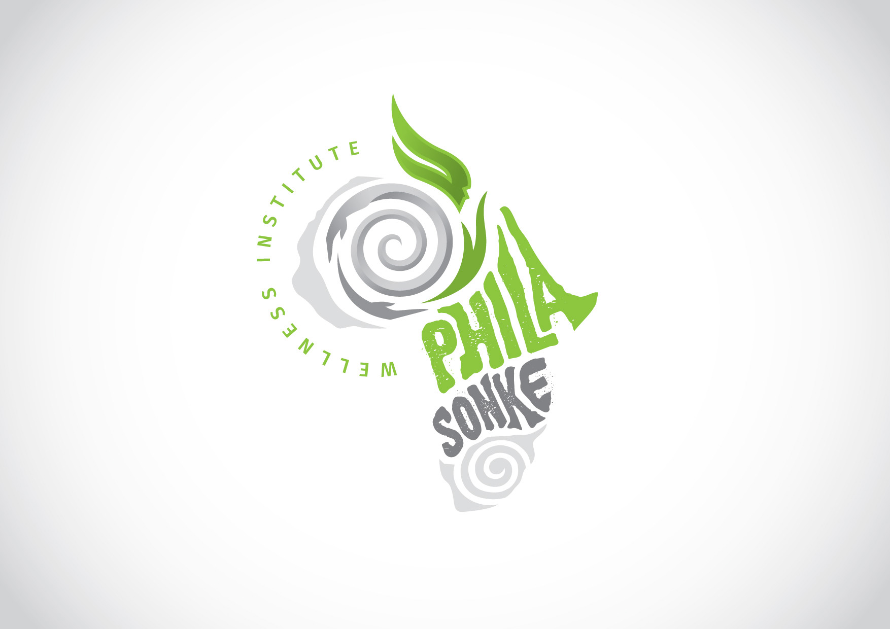
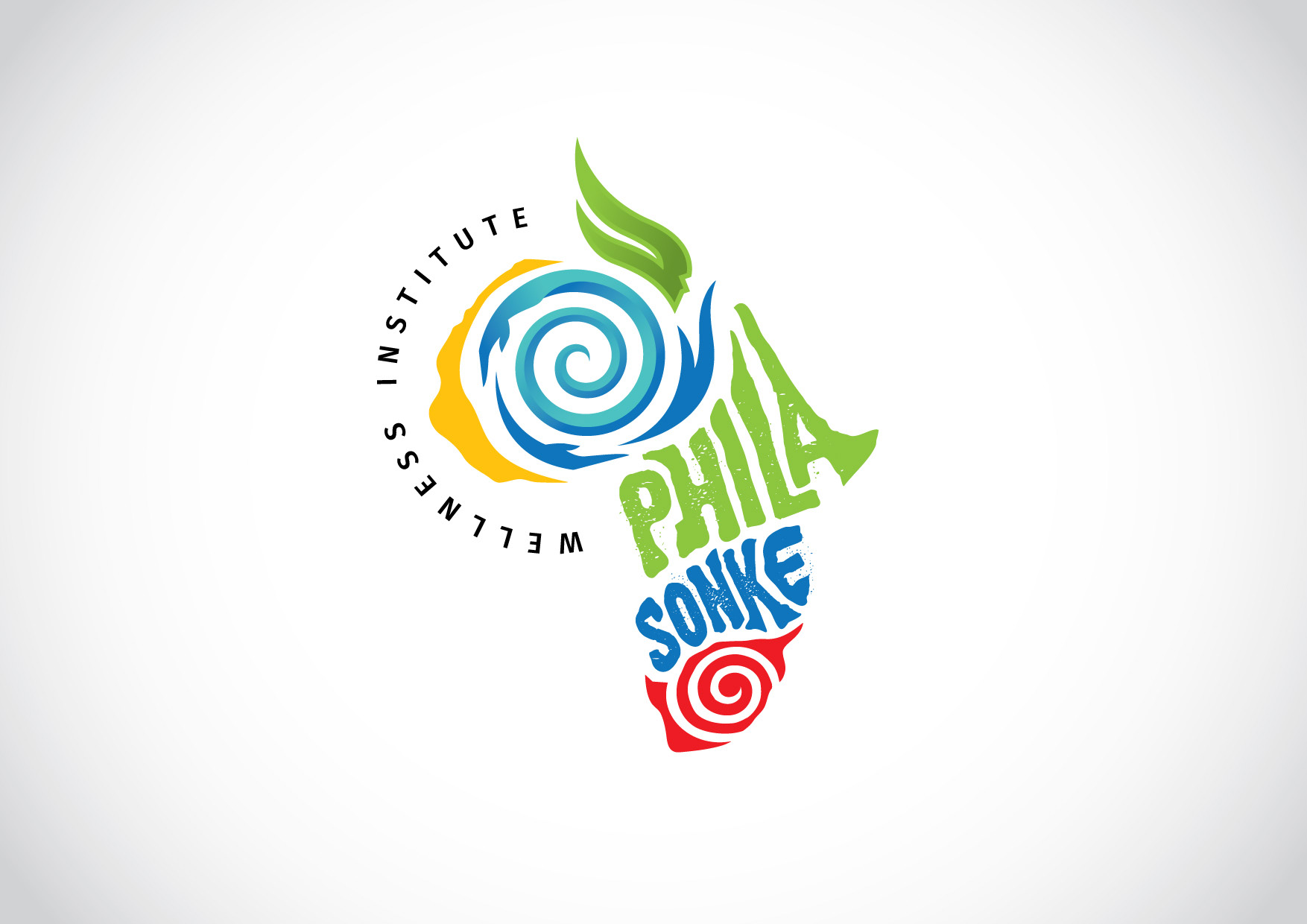
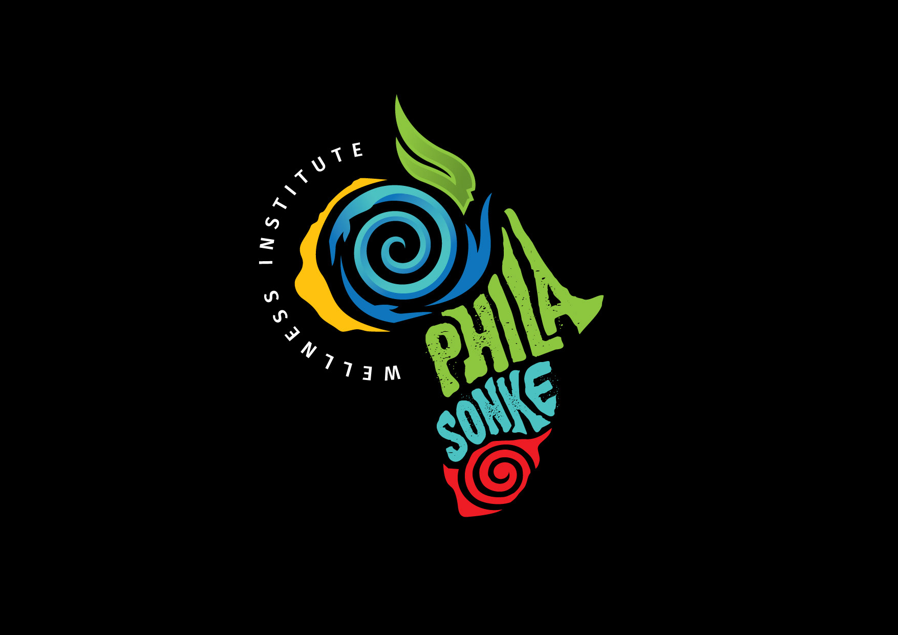
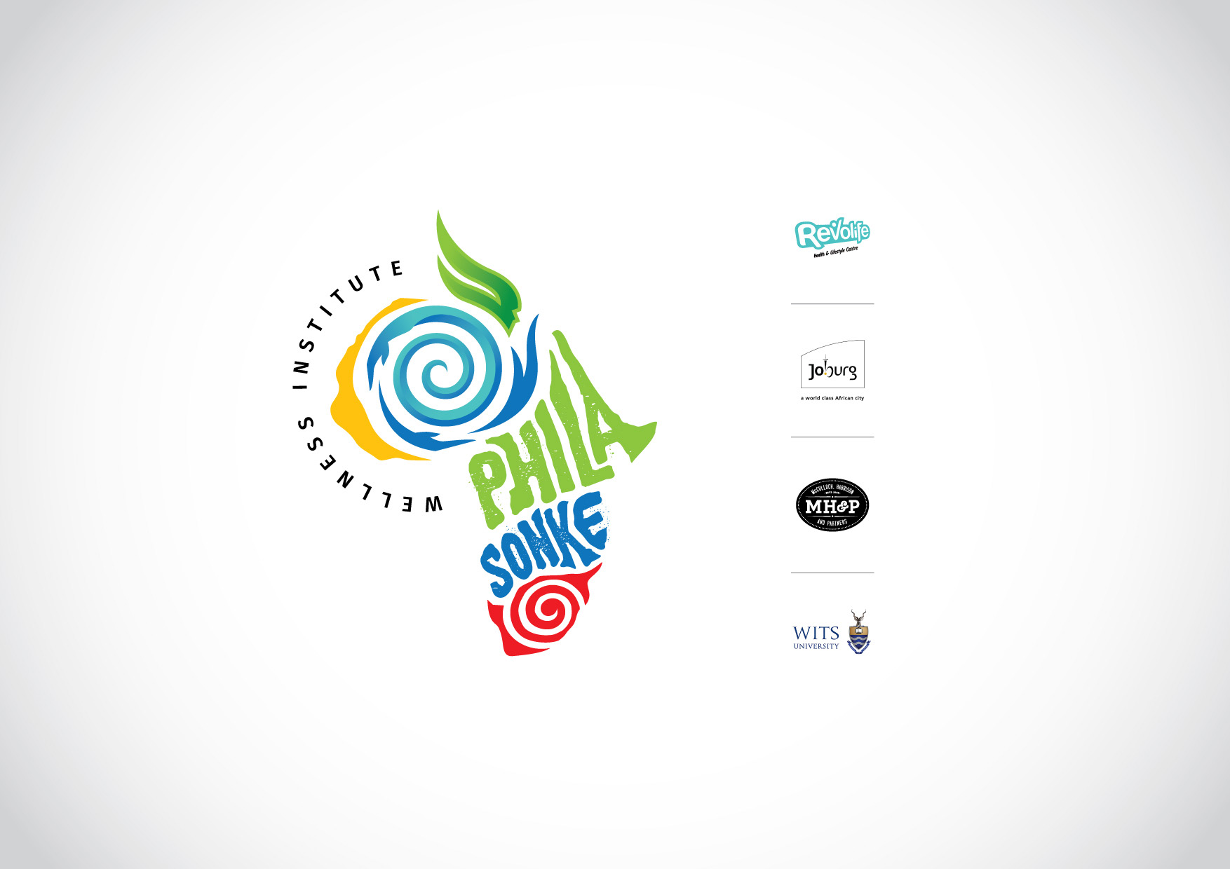
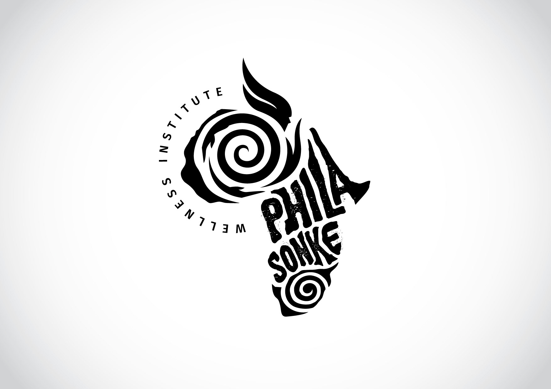
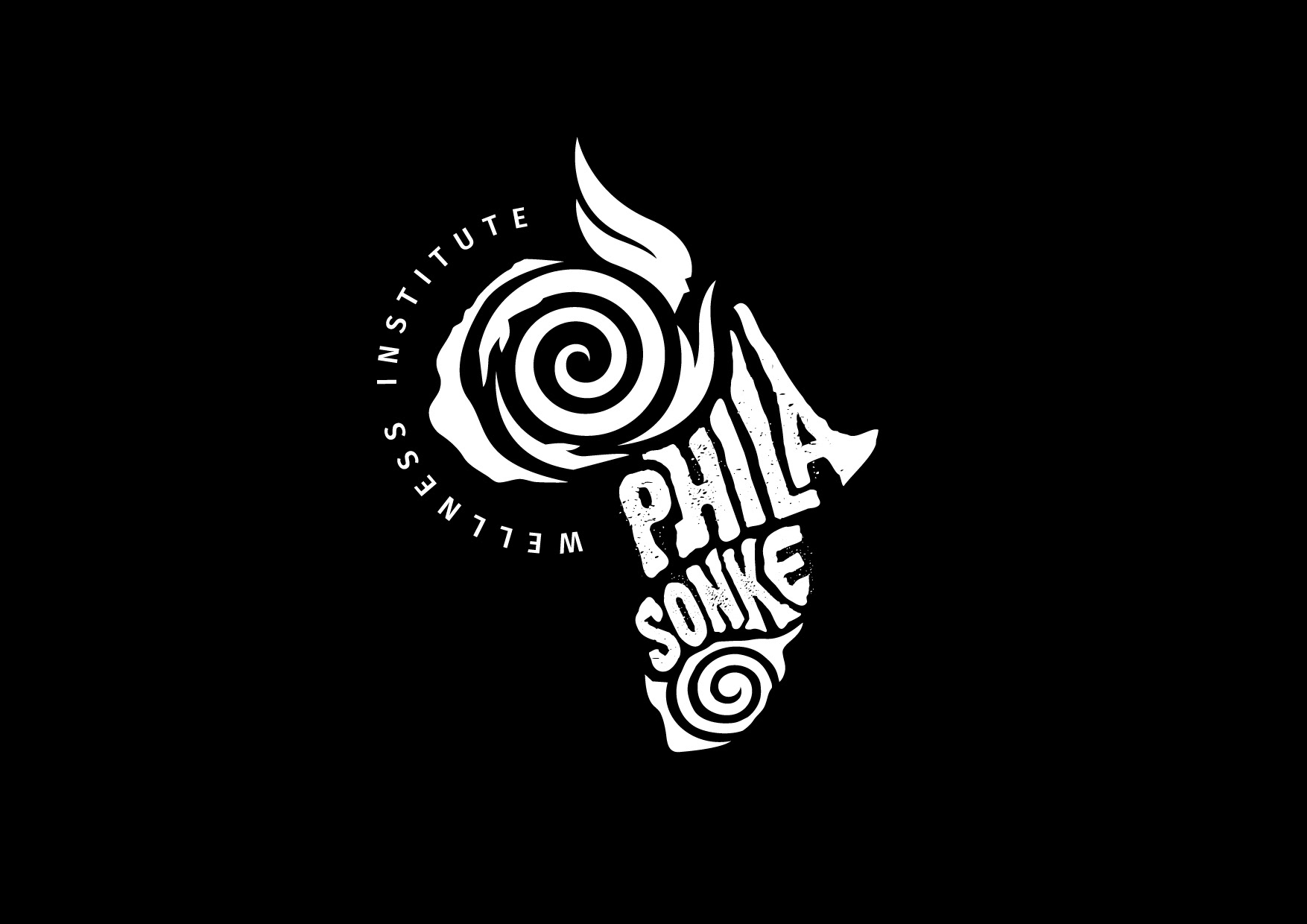
Phila Sonke is the name given to an umbrella brand that needed to be created, for a healthcare institute in Soweto. The brief was to create an identity that would emulate their vision to 'inspire wellness through community'. We had to use a few symbols to strengthen these aspects: - a spiral: depicting a wheel chair covering the 'rehab' offering - the hands turning the wheel: suggesting 'support and community' - hands changing into a leaf: eludes to wellness. The use of these elements, together with the rough typography and wording making up the shape of Africa, was the best way localize the logo.